‘Armin van Buuren’

'Armin van Buuren'

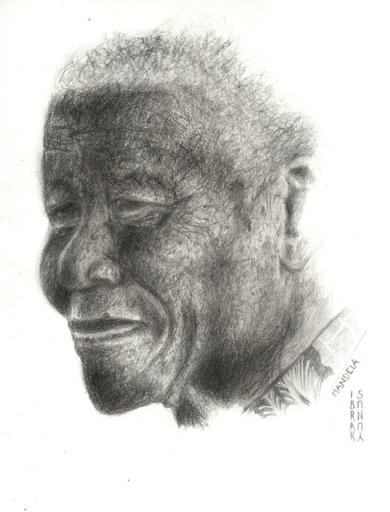
Note: click-thru the link to favourite works from my deviantArt gallery ( to support my art.. thanks :)) and check out my page at:
https://www.facebook.com/pages/The-Art-of-Ibrar-Yunus/168155153339571

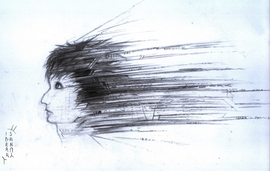
“The best new TRANCE and PROGRESSIVE in a 2 hour Mix — Th-This is a state of Trance-Trance-Trance”

These words kick-off the most famous music show world-wide, a session from Armin-Van-Buuren’s ‘A State of Trance’.

Trance genre and I go way back. Been in love with this genre of music ever since I listened to ‘In and Out of Love’, before that I listened mostly to Techno and other Electronica sub-genres.

To the newbies out there, trance and progressive music is very euphoric, melodic and even hypnotic! It induces strong emotion (as classical music did, maybe due to its tempo between 125 and 160 bpm). Hence, in an art-block, am I? Let’s listen to some Trance (and maybe Bach’s Preludium in C Major too).

——

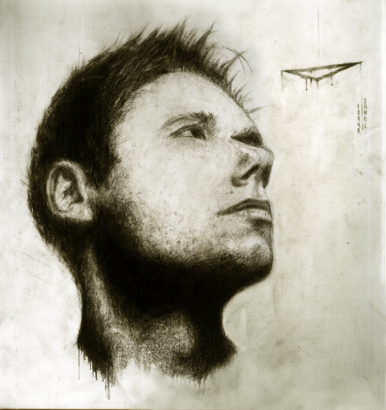
Pencils: 2H 1B 4B 6B 9B EE (super dark) charcoals

I find much of the art in these side-effects of creating art in itself. I would not use the eraser when most necessary. The rather polluted negative-space has created an aura of dream-like qualities- has as it not?

[Analysis] Terril Welch – FARM IN FOG

[Analysis] Terril Welch - FARM IN FOG

This is part analysis and part assessment.

This painting, fittingly titled the ‘Farm in Fog’, created on a 16×20″ gesso-board with a wood cradle, is quite a rousing piece of Impressionism.
The brush work is very reminiscent of Monet’s ‘The Summer, Poppy Field’ and ‘ Boy Fishing’ by Roy C. Nuse.

The painting describes a scene from a rural area. Free from the urban distortions of nature. We see only a single rooftop surrounded in trees, mist and grass with noticeable frozen dewdrops. The far background in hidden is mist – the contents hidden inside – undefined.

There is heavy fog, and hence low values of contrast. The color palette here seems very limited, I can remark on Burnt Umber, Olive Green, Prussian Green, Titanium White and Venetian Red. An expanse of ‘space’ is created by having a sparse foreground, with only the grass in proper focus and the rest of the trees and that one lone house out-of- focus ( although, paintings are meant to have everything in focus, and not photographic, with focus in the center and blurring out at the edges); hence, the use of ‘Impressionism’ for this has a dual effect, the scene and if interpreted with more ‘reality’, the background receding out of focus.
The use of rough dry brushes, has given it an aged look. As if, it is a painting from one’s vintage collection. The distortions and the ‘age’- make this painting ever more beautiful and sophisticated.

The vibrancy here is not created with color complements, but with the scene itself – regardless of the matte paints. The scene itself is fresh and alive with foliage – and nature. The blades of the grass flutter in the icy cold wind – even in this chill, ‘life’ and ‘nature’ is effervescent.

I recommend anyone who want to bring a splash of freshness into their living-room, to view it in detail ( and consider ordering it at: http://www.artsyhome.com/product/Farm-in-Fog )

Advanced Oil Painting Mediums

See here for some advanced Oil Painting Mediums and Recipes.

I shall go with Damar Varnish with Linseed/Walnut ( Why Walnut? IDK, just wanted to mimic the European Renaissance Artists – lets see what happens) binder and Turpentine as solvent.
The ‘glossiness’ and ability to retain color  is not much to my concerns; But just a means to protect the yellowed and dulled layer of paint from dust and scratches.
P.S
I do love how a painting painted with Linseed Oils only, darkens and dulls over the decades ( though can be re-lightened in sunlight). It seems to give the painting more grace and ‘importance’ in my opinion.
I have been ignoring the ‘Fat over Lean’ Oil:Pigment ratio rule for  some time now, I shall try to correct myself in the very next painting.


“Painting media from various recent manufacturers”  ~                                                      a-state-of-change.com/

Soluvar final varnish, glossy and very weather-resistant. A superior choice for protecting the finished painting. ~                                                                                             a-state-of-change.com/


The Realization

The Realization

I don’t know, but whenever I see this photograph ( from Pinterest), I hear an inner voice chanting ‘The Realization’.
I woke up this evening after quite a ‘dream’ – a lucid one. The vividness of it baffles me, but a immense break from this Reality is was – like a free ground to experiment with Art and Emotion. A training ground a lucid dream is to me.
I place the background, the foreground – balance the abstract qualities in it as I please.

And then – commit it to memory and hope to show it to others with my trusty paints and the canvas. Just eager to bridge the gap – the gap between reality and my mind.

Gone Vector!

And now, I have gone vector.

_____________________________________________________

In my endless experimentation of Art, I am unable to come to a stop.

To become stagnant; embrace only a facet of this ‘Art’?

From Impressionism to Expressionism. Realism to Abstract – all while torn between traditional Art and the Digital side.
so, what have I – what have I come across now?  I have gone VECTOR!

Starting with a Vector portrait of a friend of mine – Fahad.
^ This guy, had been urging me to make a vector portrait for quite some time of him. I had remained uninterested – not fascinated by the Vector side.  i had my reasons, for I do not feel the sense of belonging to a digital work as one would have with a hand painted traditional one.
– A single, original canvas which had been witness to the artist’s brush and fingertips does not exist – just a sequence of binary code – a series of pulses. Nothing more.

But we do have to be practical, experimentation has it’s fun and digital art does sell.  The ‘public’ shows greater interest in their portrait and that- that ‘FanArt’ rather than an original artwork! They need artwork that can be replicated, printed on shirts, cropped to a thumbnail to be set as a ‘profile image’ –

And hence, the Vector Portrait of Fahad Goraya.
Image
https://www.facebook.com/pages/The-Art-of-Ibrar-Yunus/168155153339571]

The Originals – I

The Originals - I

This is how is drew it, ( the TraDigital Artwork you see as my profile pic and the cover image – on Facebook https://www.facebook.com/ibraryunus )….
This is what it looked like before applying digital paints and ‘Photoshop’ to it. In the digital version, I focused more on making the hair look dark and ‘gothic’, but this in turn also darkened the artwork altogether ( Yes, I can darken pats separately, but then the ‘balance’ in this would be lost), and hence, the details in the ‘streams of text’ was blurred into just a dark line….
But in the original one (here), you can still see the detail in the streams of text…

Watercolors and Moon-light

These artworks by emperpep ( http://emperpep.deviantart.com/ ), an anime/manga artist on dA are certainly more than worth a look. The artist’s  art seemed to me like digital art, as it was too detailed and vibrant. Oil paints are often soft and yellowish, and with water-paints, I have little experience. So, now i see that water-paints can be used to create paintings that preserve the vibrancy and don’t get all dull as oil paintings ( though oil paintings have their advantages too). I can only wonder that how much time it would have taken to create a single piece….  One also, notices that although most of the paintings here  display moon-light scenes, they still are clear as day, and not dark; the details are same as one would do in a daylight scene….

Image

( For BladeNemesis )

Image

( Shiina and Arilyn : Surprise Hug )

Image

( Little Yamanaka for Horo-Horo-Jo )

Image

( Maemi for Yuko-Lee )

One Does Not Simply….Bi-Locate

So here I am again, freshly trolled from deviantArt, and still doesn’t giving one heck of a damn! So here, I want to share with my awesome followers a painting I did…like last Sunday? I don’t know…But here it is; Bi-Location

See these, well? so how are they?

Image

Image

Why Bi-Location? Well bi-Location is a term used in pseudoscience, the act of location one self physically at some physical space… i.e. Making a copy of oneself at some other place…. I found out about this from deviantArt forums, when everyone was discussing about mysterious things as Astral Projection and what not. I thought that this would be an awesome theme for a painting, and it sure was!  

So creating this was more difficult than the last one as the details had to be added by the knife in between the dark ‘fumes’. And it was indeed time consuming, very!  so, here are the closeups: 

ImageImageSo there? Do tell me if you have any ideas for my next painting in the series; im off to making one more right now…. 


And you can find it posted on Google+ at https://plus.google.com/110691827763571631843/posts/gv5GxoyxUec

And on DeviantART at http://zodiarkdarkja.deviantart.com/#/d5bamlc


Spreading the Word….of Eric G.C. Weets

I have been wanting to share this for quite some time, but have forgotten time and time again. Would you believe me, if I said that that the World has been missing out on a truly stellar piece of art, created by an aging artist, and has taken as of yet 56 years (and counting) to create? No? Well, as part of a community on Google+, consisting of a great many artists. We found the profile of Eric G.C. Weets ( here https://plus.google.com/116397728655683676966/about ) ( run by Filomina Pawar on his behalf).

_______

He has created a true masterpiece, which took him 56 years to create. Titled ’90 days from B to C’ is a huge painting measuring 182 x 487 cm. One cannot post this as a single image, so here, it is divided into tiles and some of them are displayed as follows ( images from Eric G.C.Weets G+ page )

( from here https://plus.google.com/116397728655683676966/posts/VB5C7rQdxmT )

Image

Divided into fragments:

Image

Details of fragments:

ImageImage

Image

So as you can see, is this amazingly complex or what?!

In Eric G.C.Weet’s own words:

I have tried to capture on canvas, with deep meditation and understanding the subconscious, the evolution of creative mind, beginning from the cave man – working the walls of his caves to the modern, contemporary, conceptual artist of today, without letting my own ego interfere in the process

And his profile on G+ states

I am dyslexic and because the problems I had with the teachers in primary school, made that most probably, I prefer drawing to writing, right from my childhood. So over the years, I developed a visual language of my own subconsciously, which led to the unique art works that I make today.

In conclusion, i would like to say that Spread the Word, so that the world knows about this; so that he can get the true recognition he deserves.

P.S.

You can also catch his regular Hangouts on his Google+ page, where he paints Live!

Ciao….